StandOut, Illustrated
StandOut lives at the intersection of brand and personality. This is a selection of visual work that helped make coaching, learning, and growth feel more human, more ownable, and more fun to engage with.
case study

What follows is a glimpse into the illustrated and character-driven work that doesn’t always make it into a deck, but says as much about range and craft as anything else I’ve built.
This work explores how a product can feel clear, useful, and enterprise-ready while still having a point of view.
BRAND IN MOTION
The foundation. Before characters, scenes, or collateral — the logo had to move. The StandOut animated logo was built as a production-ready asset and delivered to the team for use across digital touchpoints.
CHARACTERS & MOTION
Learning content works better when it has a face. These animations were built for StandOut's instructional modules — designed to add warmth, movement, and a bit of personality to moments that could easily feel dry.
 | 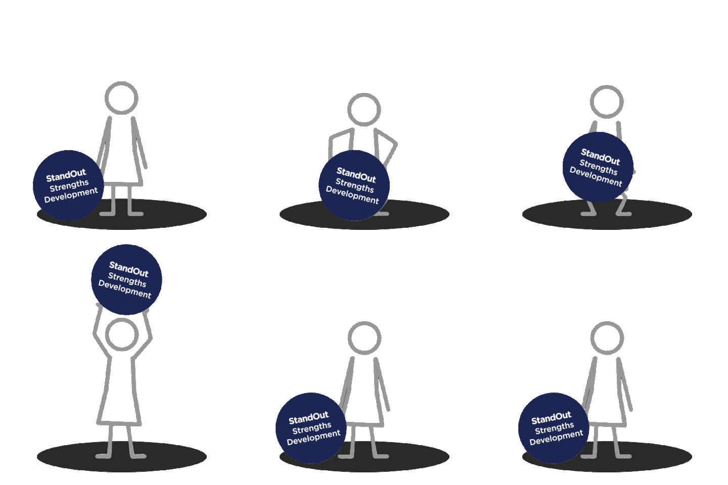 | 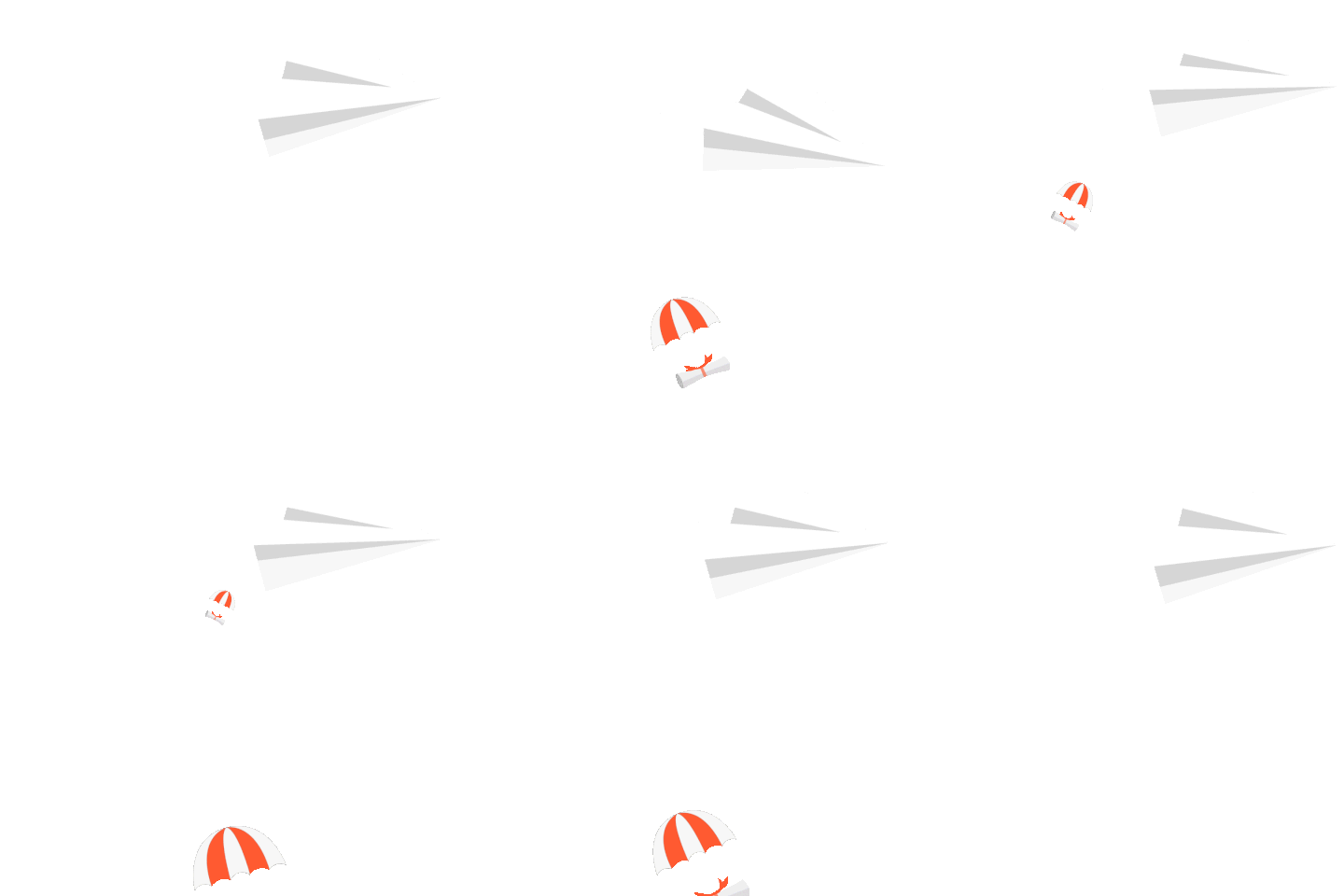 |
Character greeting — animated mascot for module openers | Stick figure lift — used to illustrate growth themes. | Paper airplane — flies across the screen and drops leaflets. |
ILLUSTRATED WORLDS
Every learning module needs a world to live in. These illustrated scenes were created as backgrounds and environments for StandOut's leadership and team development content — built to feel grounded, inclusive, and visually consistent with the broader brand.

Custom illustrated environments — office interiors, shared spaces, and team settings designed for use across multiple StandOut learning modules.
TOUCHPOINTS & COLLATERAL
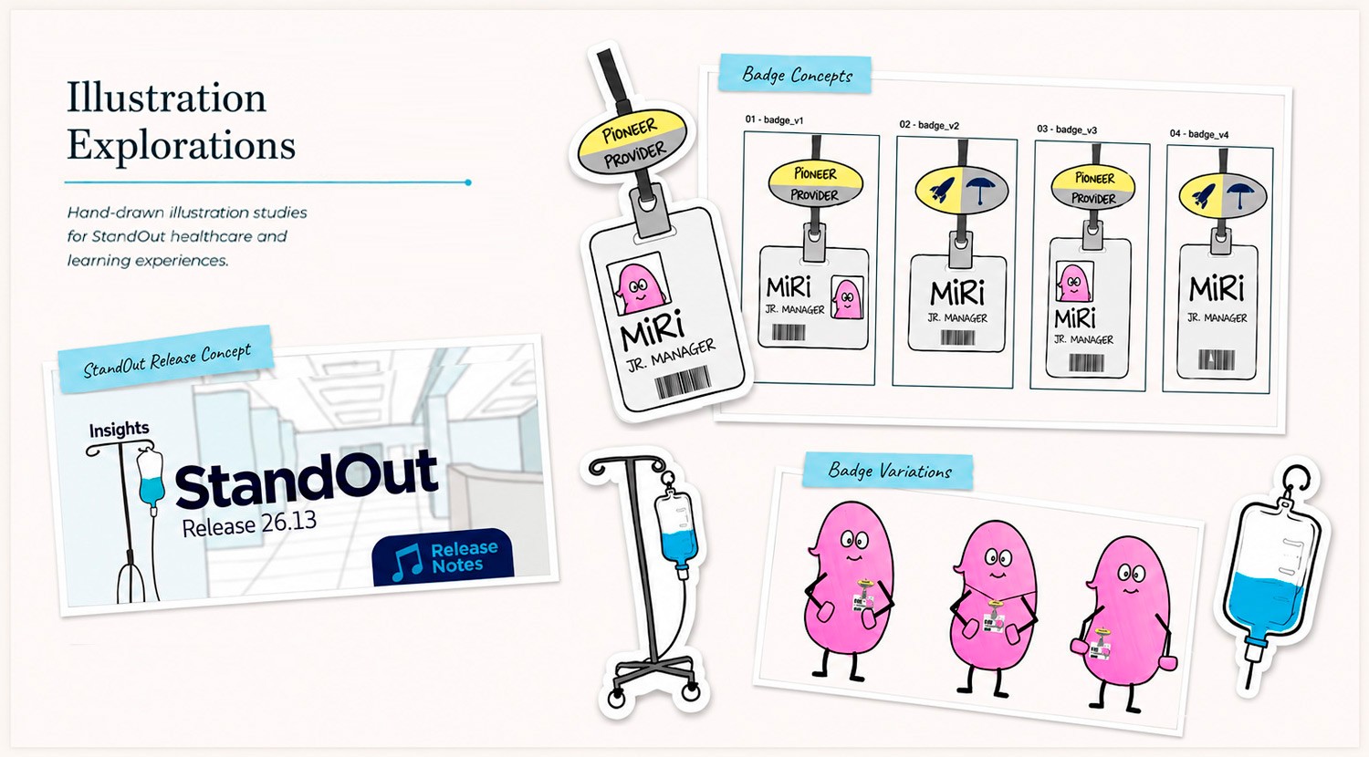
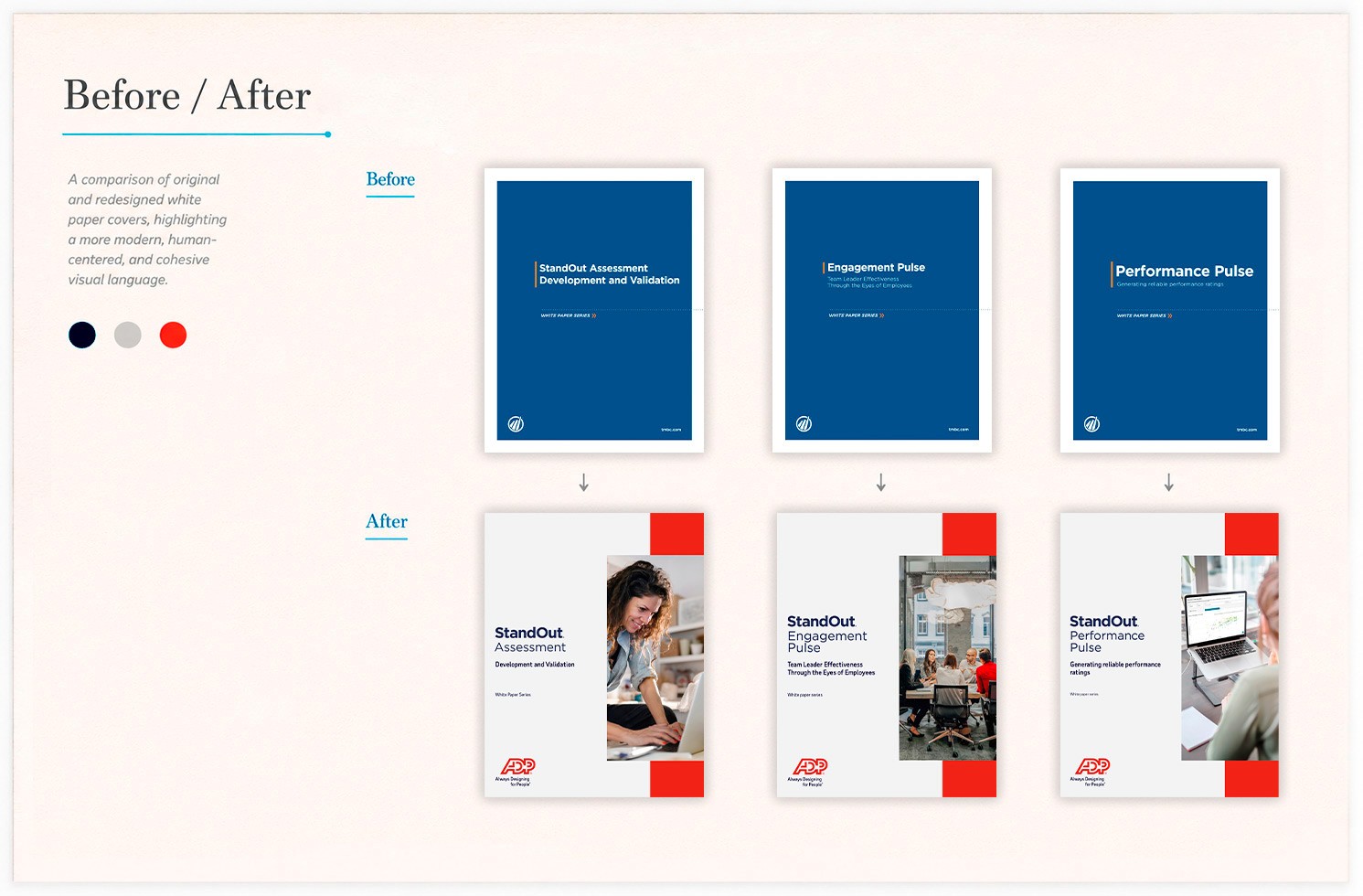
Brand lives in the details. Alongside the larger motion and illustration work, I designed across a wide range of smaller touchpoints — icons, badges, document covers, and branded merchandise. The before/after document covers show the kind of quiet but meaningful consistency work that rarely gets seen.
CLIENT ADVISORY BOARD 2025 — DESERT EDITION
Once a year, StandOut's most strategic clients gather for the Client Advisory Board in Phoenix, Arizona. The brief for CAB 2025 called for something that captured the spirit of the Southwest — part wayfinding poster, part illustrated infographic, part visual summary of everything discussed in the room. The jackalope was a natural choice for a mascot: mythical, a little absurd, and completely at home in the desert.

CAB 2025 event poster. Full illustrated infographic combining thematic art direction, hand-lettering, and dense information design — built to work as both a room anchor and a keepsake.
*Details redacted for confidentiality. Composition, art direction, and visual structure shown.
———————————————————————————————————
This is one thread of a much larger body of work at StandOut — whitepapers, pitch decks, case studies, campaign assets, and presentation systems built over the course of the engagement. But this is the thread that's most fun to look at.
role
Senior Designer — Brand, Motion & Illustration
impact
Animation, illustration, and design — the playful side of StandOut.
scope
Brand motion, learning modules, event materials, collateral
category