
Email Design System
A modular email design system for Western Union that improved global campaign consistency, reduced production time by 35%, and increased email engagement. Built with reusable components, brand guidelines, and scalable templates.
case study

As part of the global email system, I created a structured library of reusable modules, layout rules, visual components, and production guidelines. The goal was to give teams enough flexibility for different campaign needs while keeping every execution aligned with the brand.
Modular Structure
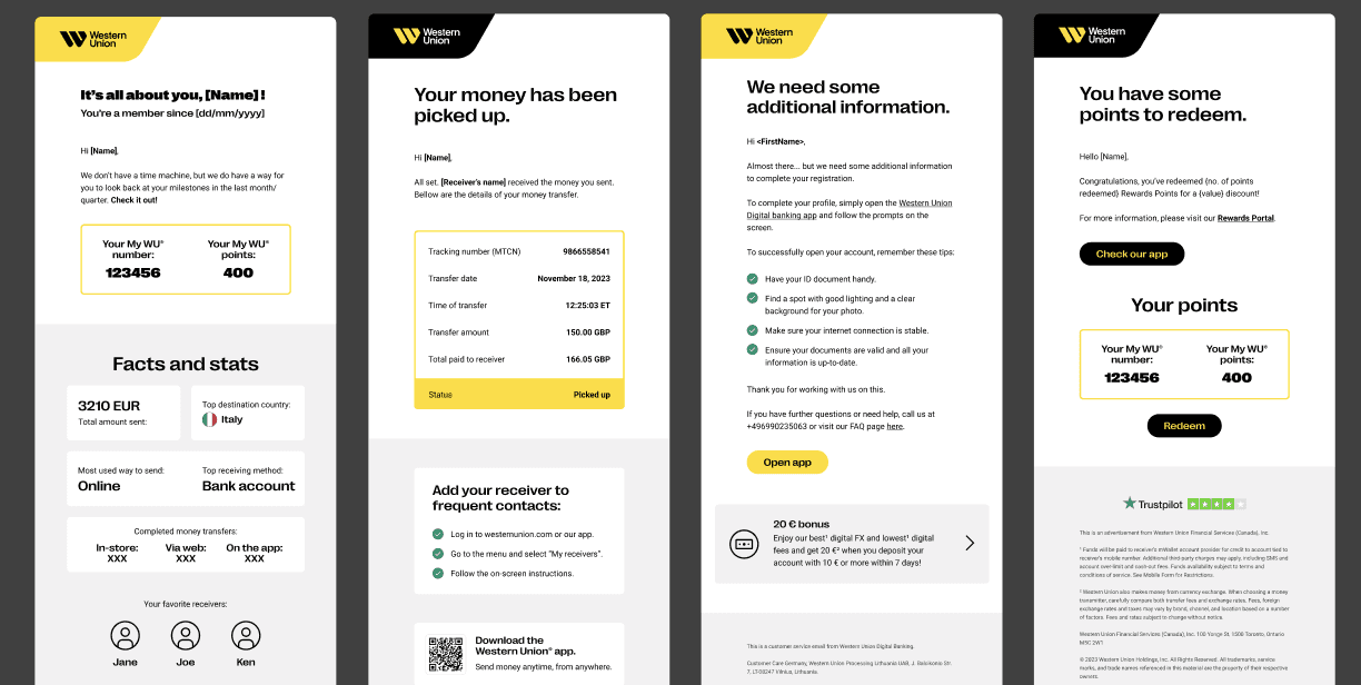
The system was built around reusable modules that could be mixed, matched, and adapted across different campaign types, including hero sections, promotional blocks, feature modules, CTA areas, legal copy, and responsive layouts.
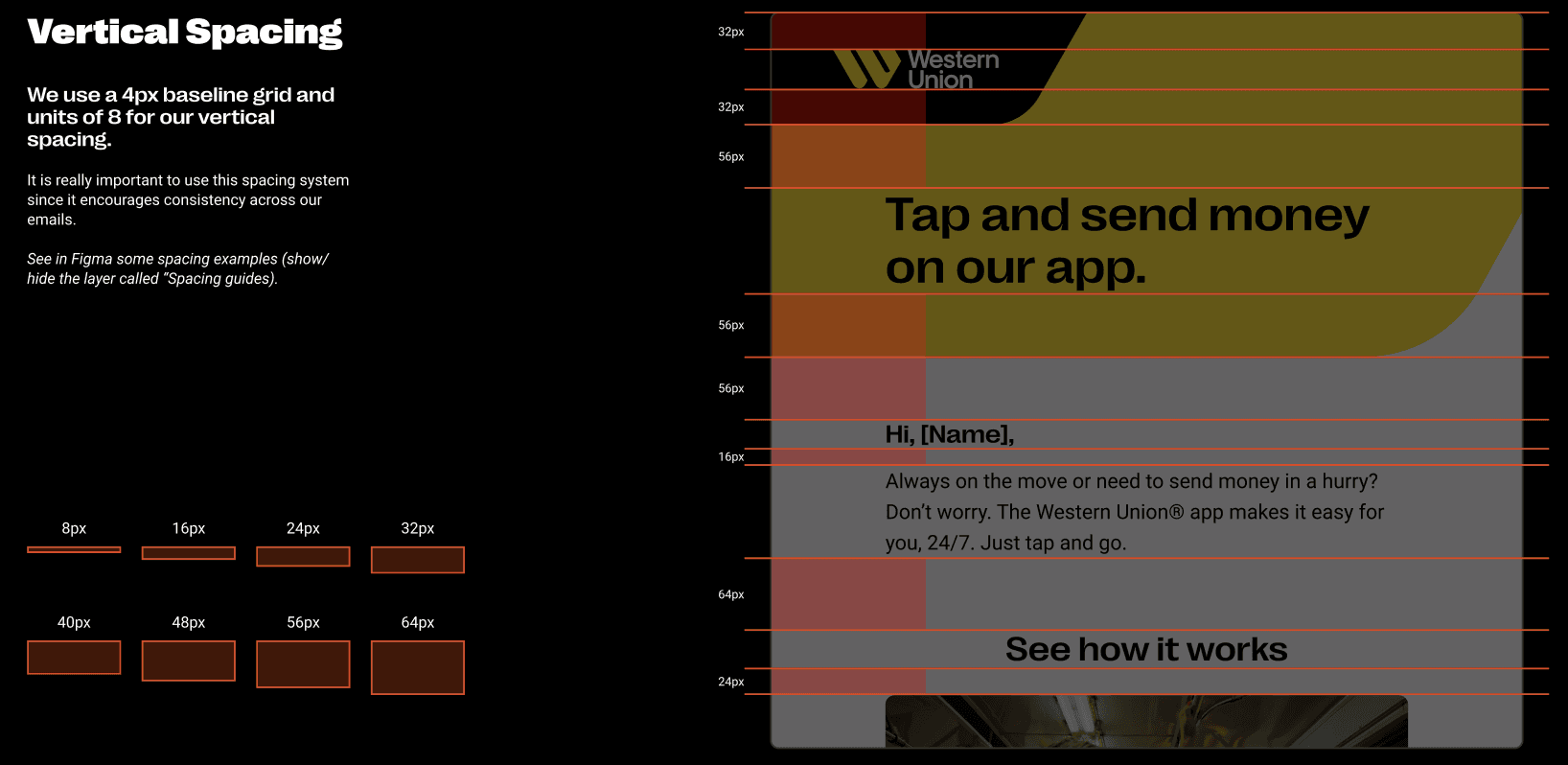
Typographic System
I defined a clear typographic hierarchy for headlines, body copy, supporting text, legal disclaimers, and calls to action to improve readability and consistency across devices and markets.


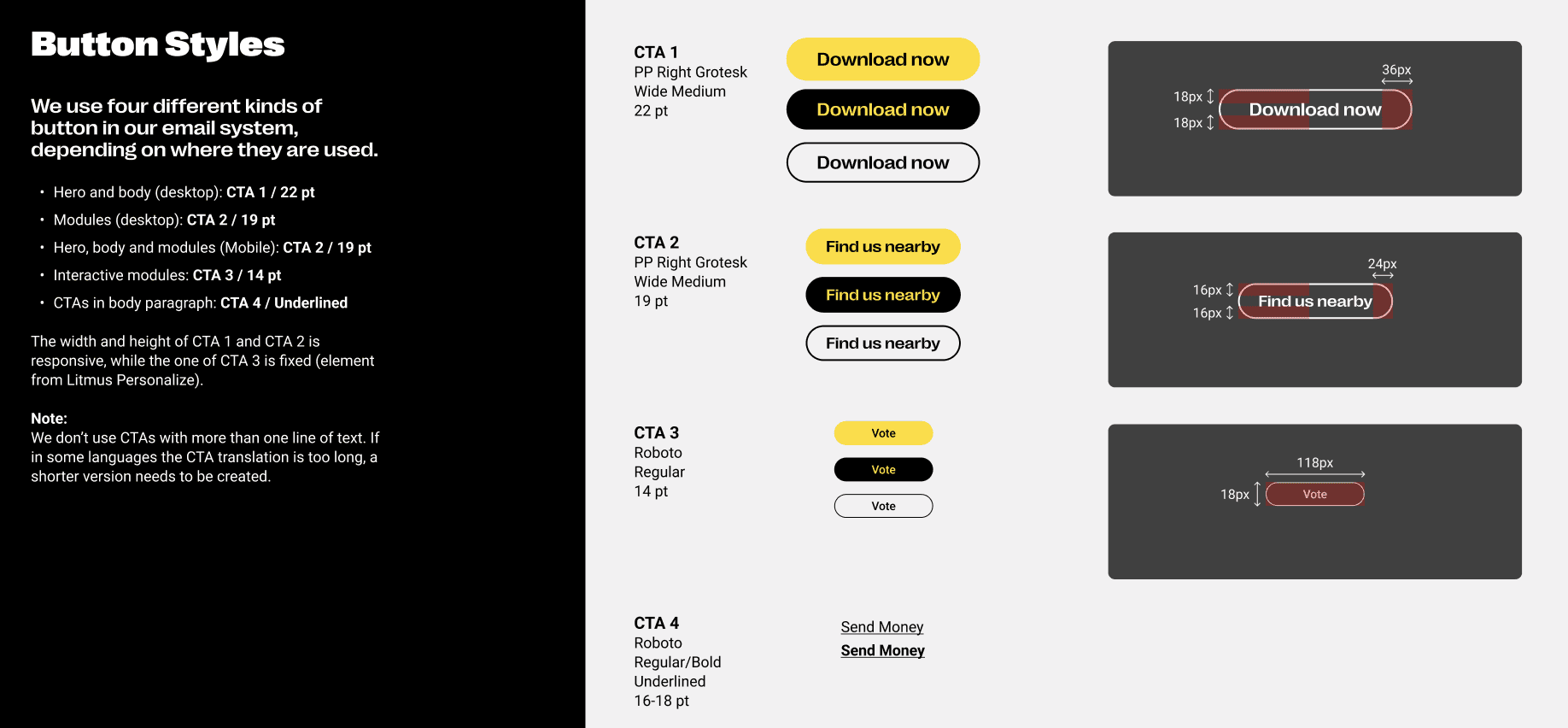
Visual Elements & Brand Assets
I created and organized reusable brand assets, including icons, illustrations, flags, image treatments, buttons, and modular visual elements to help teams build campaign emails faster and more consistently.
Iconography and illustration styles


CTA/button design (primary/secondary/utility)
Imagery and background logic
Flags and co-branded visual cues
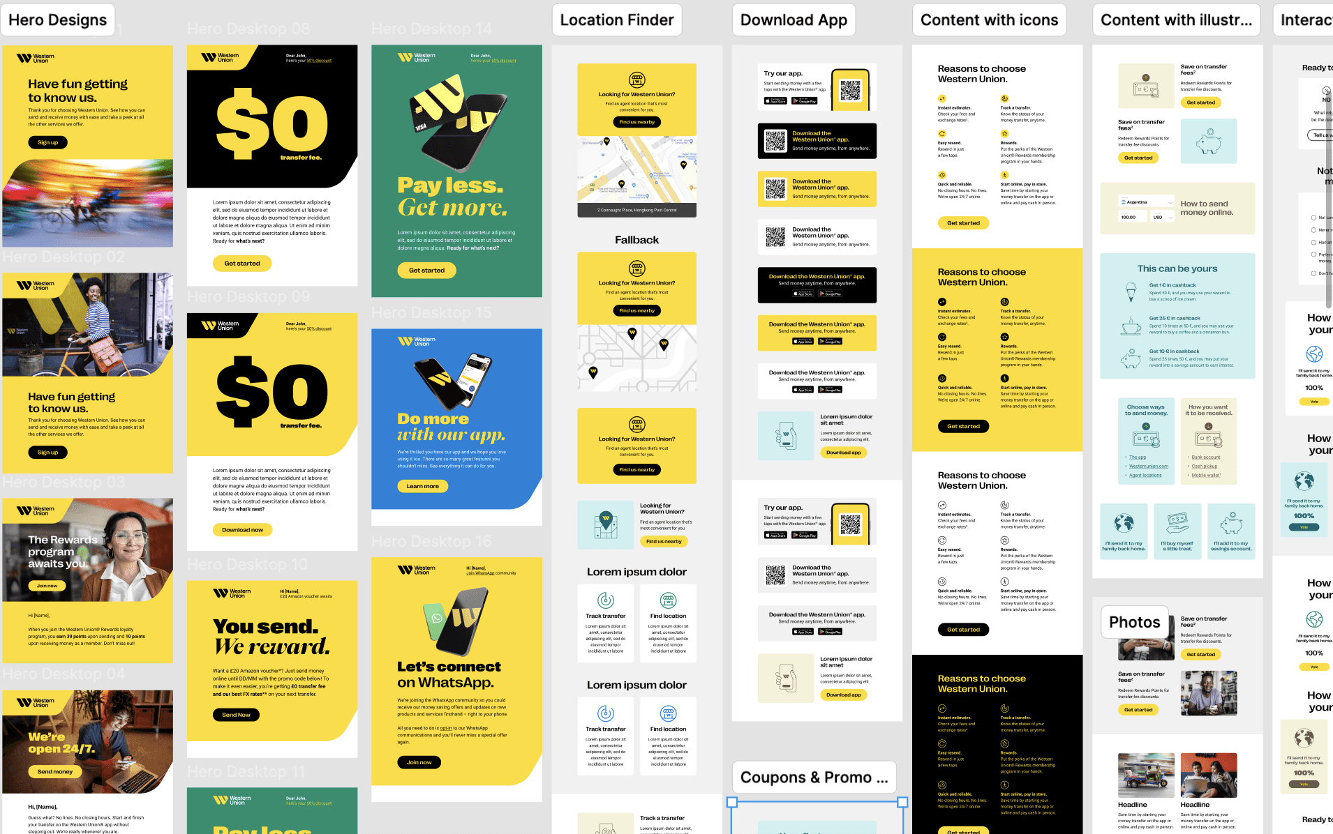
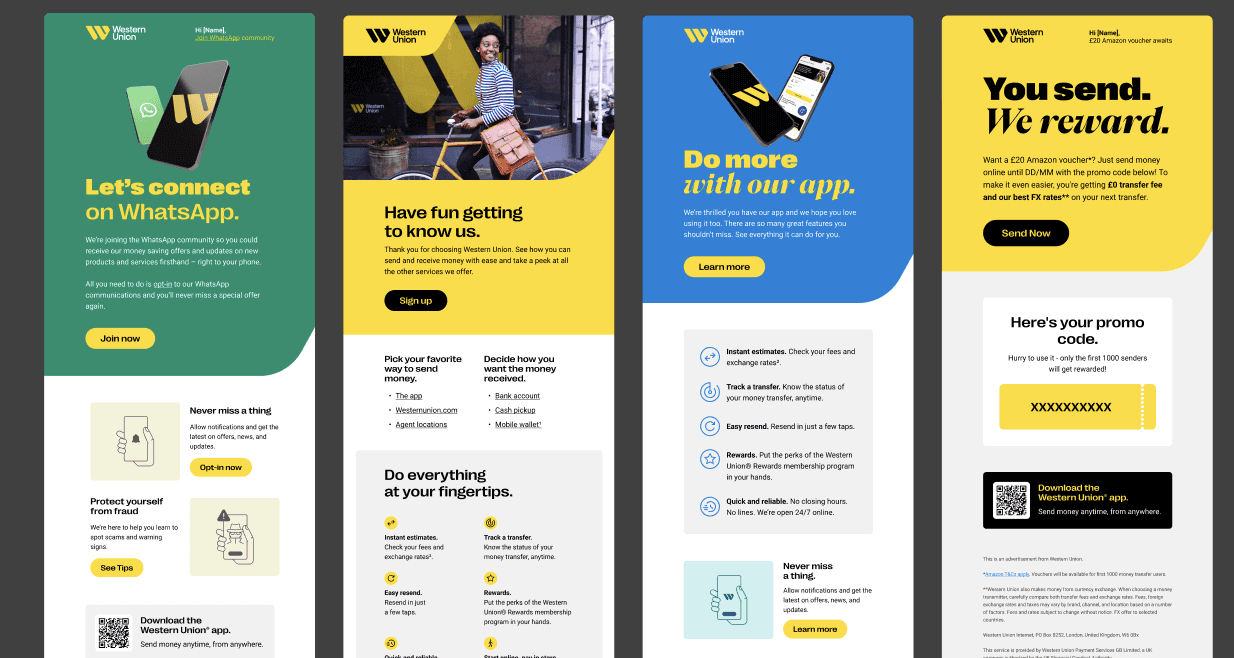
Use Cases & Real Examples
The system was applied across promotional emails, app campaigns, seasonal offers, service messages, and regional marketing communications, showing how the modular framework could flex across different content needs.
Marketing emails: promos, launches, loyalty, rewards
Service emails: confirmation, onboarding, password reset
Global Enablement
The system supported global rollout and day-to-day production by giving internal and external teams a shared toolkit for building emails faster, reducing repetitive work, and maintaining quality across markets.
role
Lead Designer
impact
+23% CTR, +18% open rate, -35% production time.
scope
Email Design System, Figma Library, Templates, Guidelines, Global Rollout
category