Pricing Campaign

The campaign was designed to deliver a clear and compelling message: send money with a highly competitive fee. By making price the visual and narrative focal point, we drove immediate attention to the offer across digital and POS touchpoints.

case study

background

There were two strategic directions depending on the market needs:

  1. Fee-led proposition — where the transfer fee is the core value driver and takes visual priority.

  2. FX-led proposition — in select markets, a stronger exchange rate becomes the primary message.

To maintain clarity, we avoided combining fee and FX messaging in a single layout

objectives

Develop a scalable visual system centered on price communication. Ensure consistency and clarity across global adaptations. Pair rational value with emotional visual storytelling to increase response and trust.

context

background

There were two strategic directions depending on the market needs:

  1. Fee-led proposition — where the transfer fee is the core value driver and takes visual priority.

  2. FX-led proposition — in select markets, a stronger exchange rate becomes the primary message.

To maintain clarity, we avoided combining fee and FX messaging in a single layout

objectives

Develop a scalable visual system centered on price communication. Ensure consistency and clarity across global adaptations. Pair rational value with emotional visual storytelling to increase response and trust.

results

+17% increase in customer engagement

across Western Union’s website and mobile app — driven by simplified messaging and clean visual hierarchy.

+24% lift in international transactions

+24% lift in international transactions

in targeted markets — a direct result of clearly communicating the value offer and simplifying user decisions.

results

+17% increase in customer engagement

across Western Union’s website and mobile app — driven by simplified messaging and clean visual hierarchy.

+24% lift in international transactions

in targeted markets — a direct result of clearly communicating the value offer and simplifying user decisions.

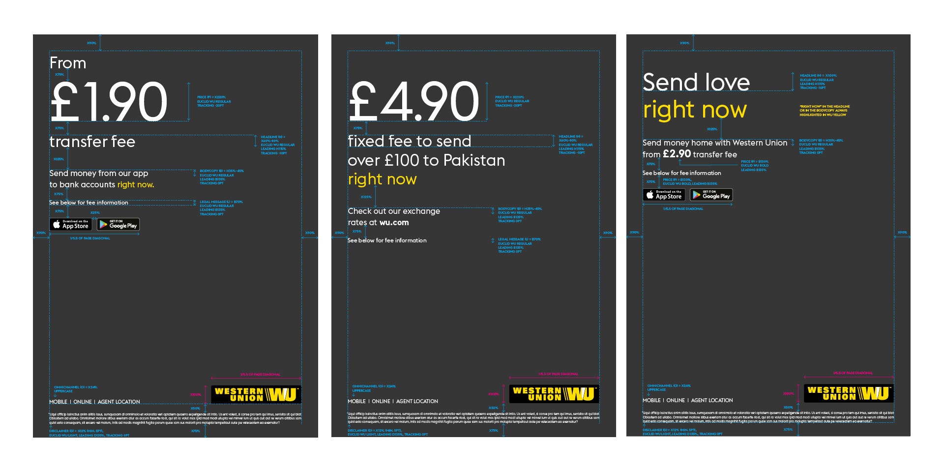
We designed a set of adaptable templates for digital banners and POS placements, focusing on modularity and reuse. These templates included structured zones for pricing, consistent type treatment, and layout guidance — making it easy for local markets and agencies to execute while maintaining brand standards.

here are some examples of online banner template layouts we did.

Visual Direction & Image Strategy

1. Surprised & Delighted

To support the competitive pricing message, we curated authentic and expressive portraits of culturally relevant individuals reacting with joy and surprise — real people with relatable energy, reflecting the tone of modern money movers.

  1. Digital Users

For digital-only offers (app or .com), we featured people using mobile phones in natural, unposed settings. Images aligned with our core principles: modern, colorful, culturally relevant, emotionally authentic.

3. Energetically Optimistic

We also included imagery with spontaneous “found yellow” elements — capturing the positive, energetic spirit of the Western Union brand in everyday moments.

Co-Branding & System Use

We provided a suite of templates and visual references to support co-branded executions, allowing local teams to integrate their own messaging without compromising brand integrity or visual clarity.

Conclusion

This campaign demonstrated the power of focused visual communication and strategic design systems. By simplifying the message and elevating the user experience, we successfully increased engagement and conversions across key markets. The modular design approach ensured consistency, speed, and brand clarity — proving that strong creative execution can directly impact business outcomes.

role

Creative Direction and System Architecture

year

2021

timeframe

1 month

category

Integrated Campaign

say hello

i'm open for freelance projects, feel free to email me to see how we can collaborate

say hello

i'm open for freelance projects, feel free to email me to see how we can collaborate