
Western Union Brand Refresh
A global brand refresh brought to life across digital products, marketing campaigns, and scalable visual systems for international markets.
case study

Brand System Development
As Lead Designer on the Western Union brand evolution, I helped translate strategic direction into a cohesive, flexible, and scalable visual system. Working within the global brand team, I developed design guidelines and production-ready assets that supported consistency across digital, print, campaign, and motion touchpoints.
The refreshed identity introduced a bold graphic language built around clarity, modularity, and strong brand recognition. A signature angled shape became a key visual device, supported by a structured grid, updated typography, and flexible layout principles that could scale across regions and formats.


Brand System in Figma
To support the global rollout, I built a modular Figma system with reusable components for campaign templates, digital banners, social assets, print layouts, and video direction. The system helped speed up production, improve consistency, and make the refreshed brand easier for internal and external teams to apply.
I also developed template systems for Google UAC, display ads, and web banners across multiple sizes and aspect ratios, helping maintain a consistent look and feel across high-volume campaign production.

I worked on templatizing static banners for Google UAC, Display and various web banner sizes and aspect ratio to have the consistent look and feel.

Motion System & Video Direction
I collaborated with motion designers to extend the refreshed brand into animation and video. I helped define motion principles and art-directed logo behavior, typography movement, transitions, and pacing to keep the brand expression consistent across digital channels.

Out of Home — Wild Postings.
I contributed to the concept and execution of out-of-home formats, applying the new brand language to bold, high-impact layouts in real-world contexts. The work explored typography, photo direction, repetition, and rhythm to create campaign visuals that felt recognizable, energetic, and easy to read at a glance.

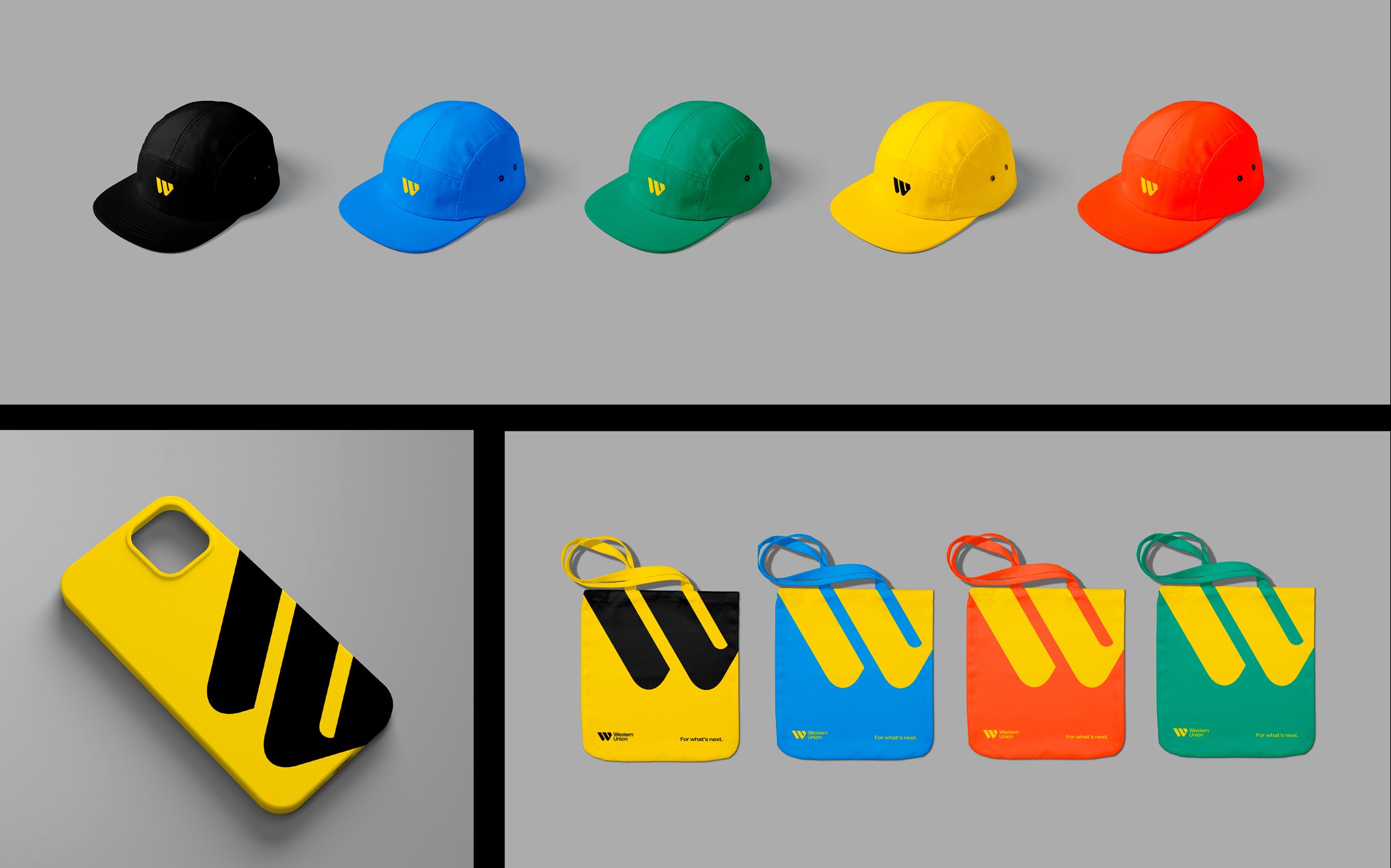
Merchandise & Physical Touchpoints.
I supported the application of the identity system across merchandise and physical brand touchpoints, focusing on color consistency, symbol placement, and clarity across formats. These executions helped show how the refreshed identity could extend beyond screens while remaining simple, recognizable, and globally adaptable.
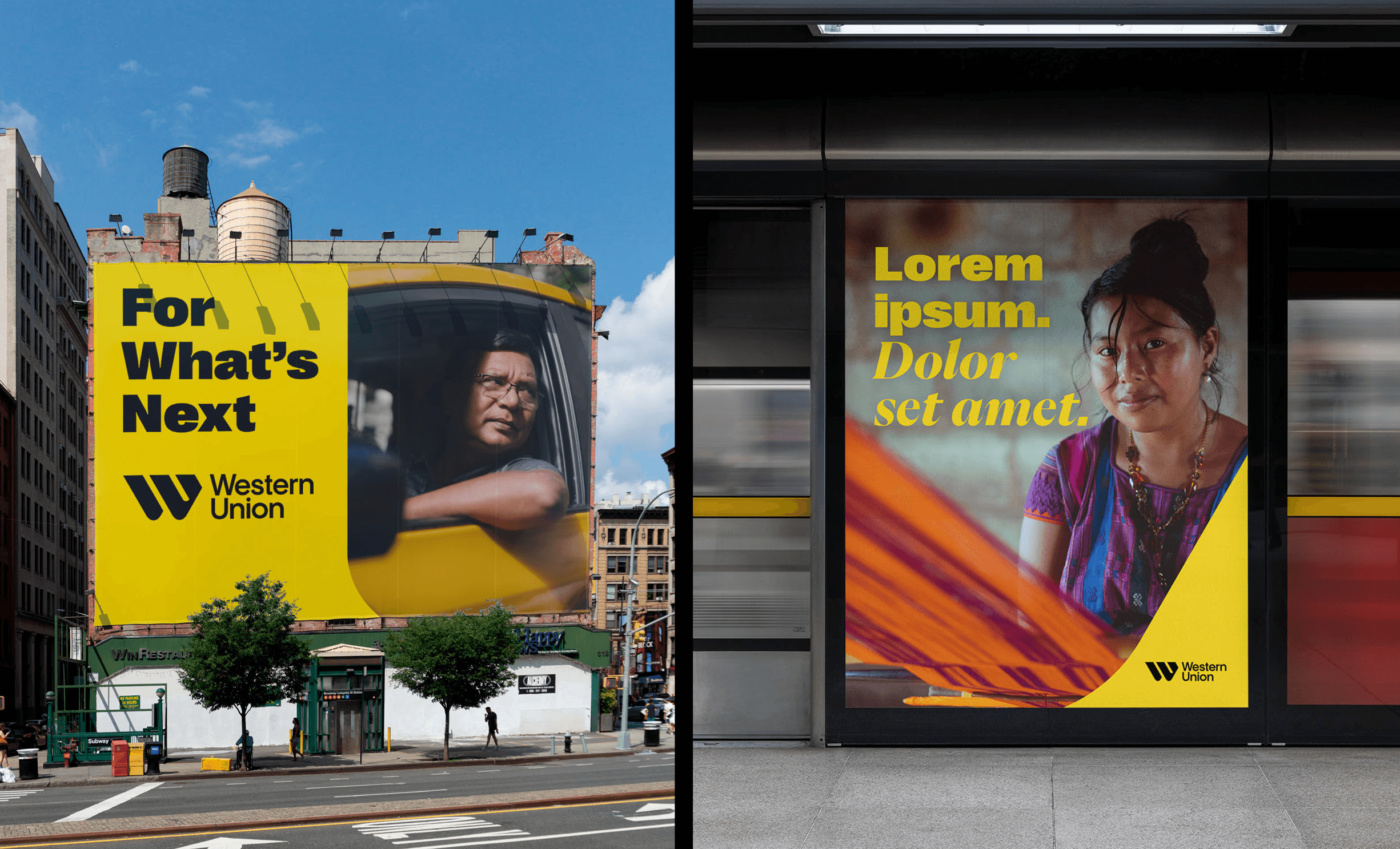
Out of Home — Billboards & Transit.
I adapted the system for large-scale placements, focusing on visual impact, readability, and quick message recognition. These executions showed how the refreshed brand could flex across mass-market communication, partner campaigns, and more personal storytelling formats.
role
Lead Designer - Creative Direction, Brand and Creative Campaign Strategy, Graphic Design, Motion Design, Print Design
impact
20+ market rollout; contributed to $6.5M+ in annual agency cost savings.
scope
Brand System, Campaign Design, App Visuals, Motion Direction, OOH, Figma Library, Global Rollout
category